Brand Guidelines
Our Brand
Logo, colors, typography and how we use them — publicly documented. This page is both a reference for partners and proof that we mean what we sell.
Between people and technology
Medienstürmer grew out of two worlds: communication and development. We have never separated what belongs together – the idea and its execution, the message and the technology behind it. Now that machines communicate themselves, this connection matters more than ever.
This page is our binding standard. Anyone working with our brand — team members, partner agencies, print shops — finds everything they need here, downloads included. And if you want to know how we think about brands: exactly like this.
- Vision
- Technology that understands people.
- Mission
- We bring communication and development together, so companies create technology that reaches their people – and communication that makes their technology understandable.
The logo
The wordmark is our most important identifier. It exists in exactly two color variants: white for dark surfaces, navy for light ones. Nothing more is needed.


Clear space: keep at least the height of the “M” free around the logo — from text, images and edges.
Please don’t
The colors
Two colors carry the brand: navy is the stage, coral the accent. Coral is used sparingly — only where action happens. The grays handle everything in between.
Rule of thumb: navy may fill surfaces, coral never. If coral is more than an accent, it’s too much.
The typeface: FF Meta Pro
One type family for everything — from headline to caption. FF Meta Pro is precise without being cold and stays highly legible at small sizes. Weights: regular for body copy, medium for emphasis, bold for headlines.
Display / H1
Bold · 48–60px · tracking-tight
We storm media.
Headline / H2
Bold · 30–36px · tracking-tight
Clear, direct, well-crafted.
Subline / H3
Semibold · 20–24px
Strategy, creation and technology from one team.
Body
Regular · 16–18px · leading-relaxed
Body copy stays calm and highly readable — even over long stretches. No gimmicks, no cramped spacing.
Caption
Regular · 14px · text-secondary
Captions and meta text step back.
The design
Our design follows one principle: reduction. Few elements, plenty of space, a clear hierarchy. The brand is recognisable through calm, not decoration.
White space structures
We separate sections with surface and spacing – not with lines, frames or graphics.
Typography leads
Large, calm headlines in FF Meta Pro create the hierarchy. No ornaments needed.
Navy carries, coral acts
Navy and white carry every surface. Coral appears only where action happens: in the main button.
Images stay images
Photos stand rectangular and unaltered – no slanted frames, filters or overlays.
Rule of thumb: if an element only decorates, we leave it out.
The imagery
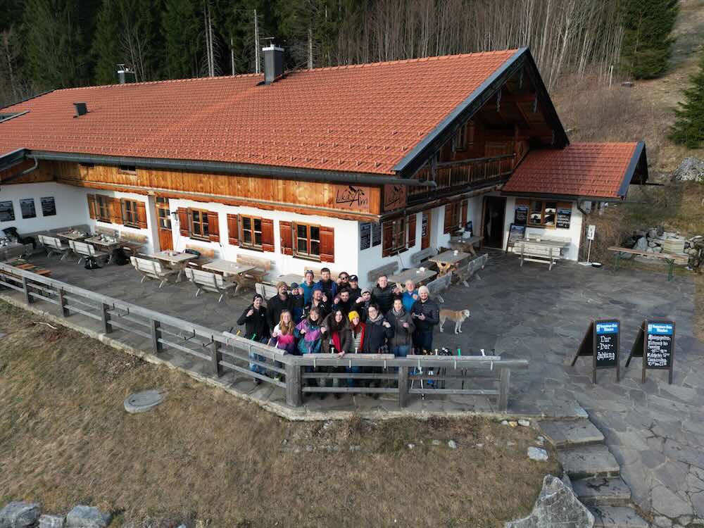
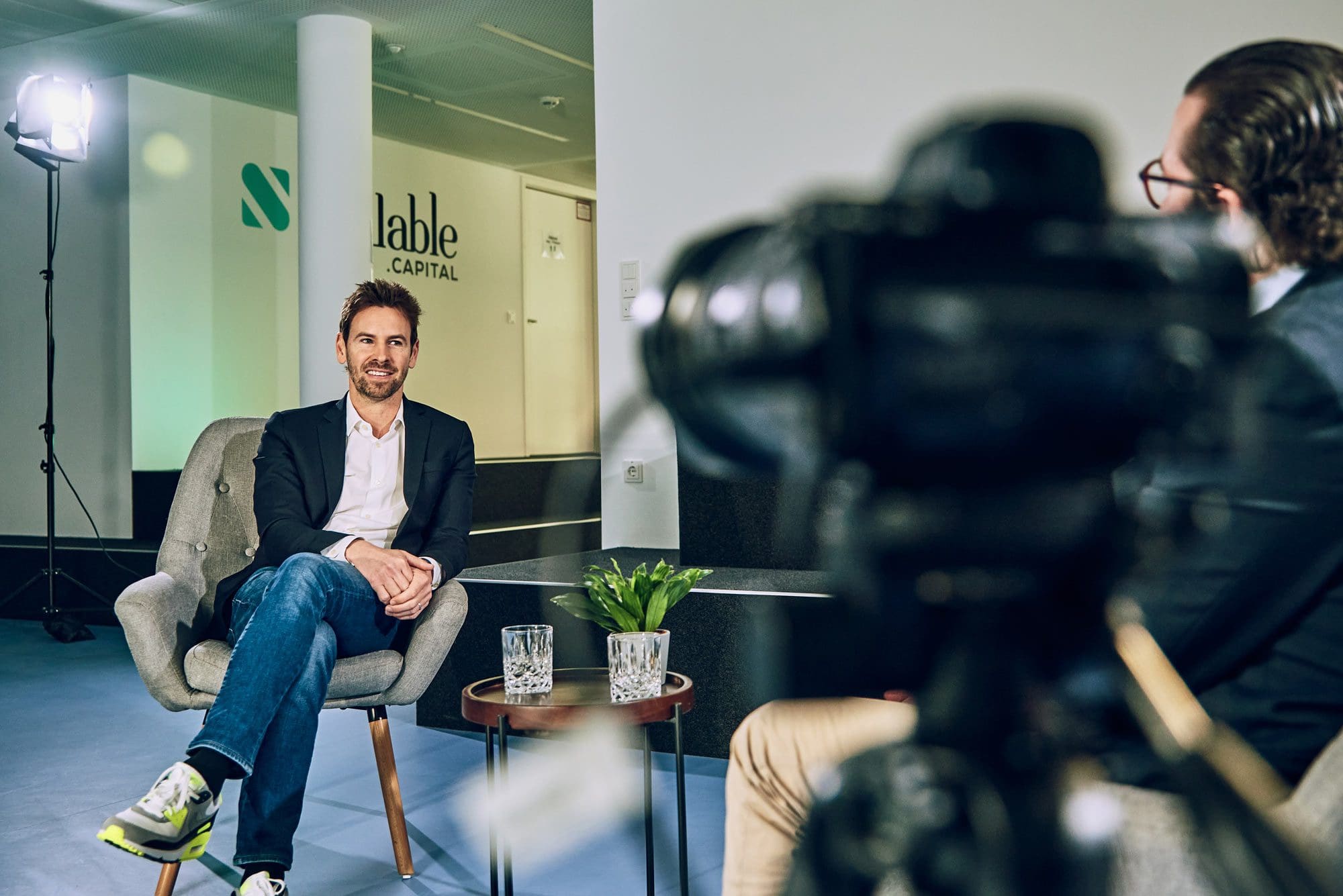
Our images come from our own productions — in the studio, at clients, on projects. Three principles always apply:
01
Real people
Anyone in our photos actually works here or with us. No models, no staged scenes.
02
Own productions
Photography and video are part of our craft — our own images are produced with the same standards as client work.
03
No stock look
An honest working photo beats a perfect symbol image. Authenticity over gloss.




The brand in use
A brand proves itself not in the styleguide but in application. This is what Medienstürmer looks like day to day:
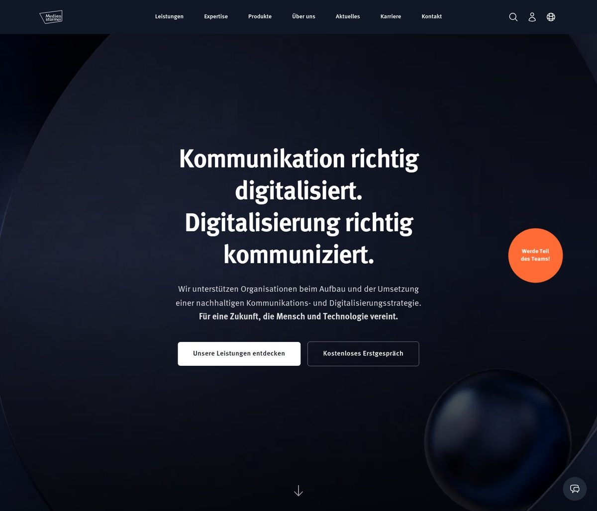
Website
Navy as the stage, coral as the accent, FF Meta Pro throughout — medienstuermer.de is the reference application.
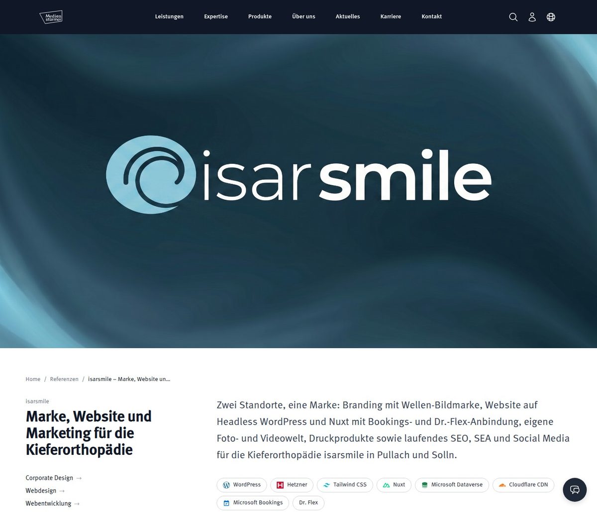
Case studies
References tell projects in the client’s imagery — framed by our typography and structure.
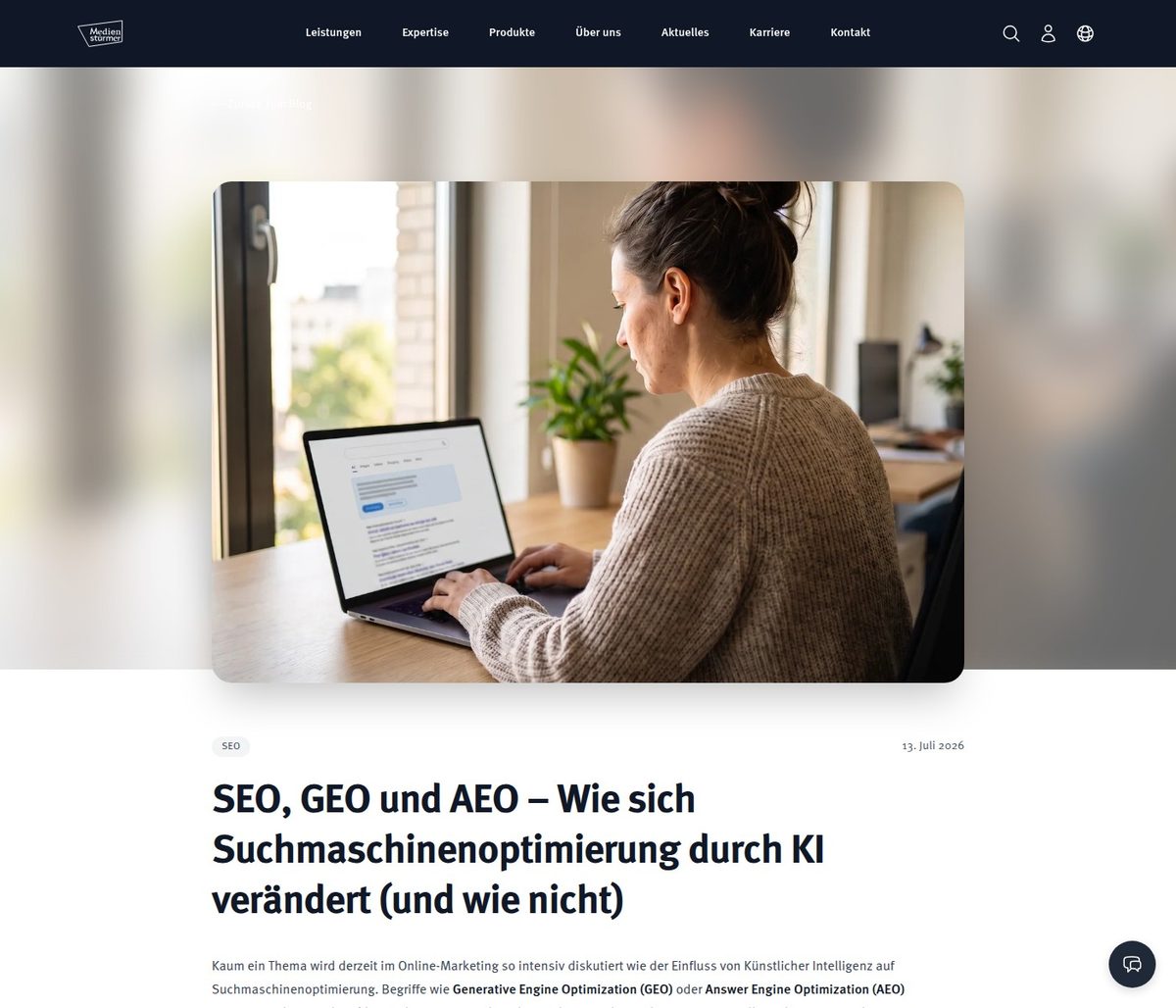
Blog & content
Long reads in calm typography, diagrams in the brand colors.
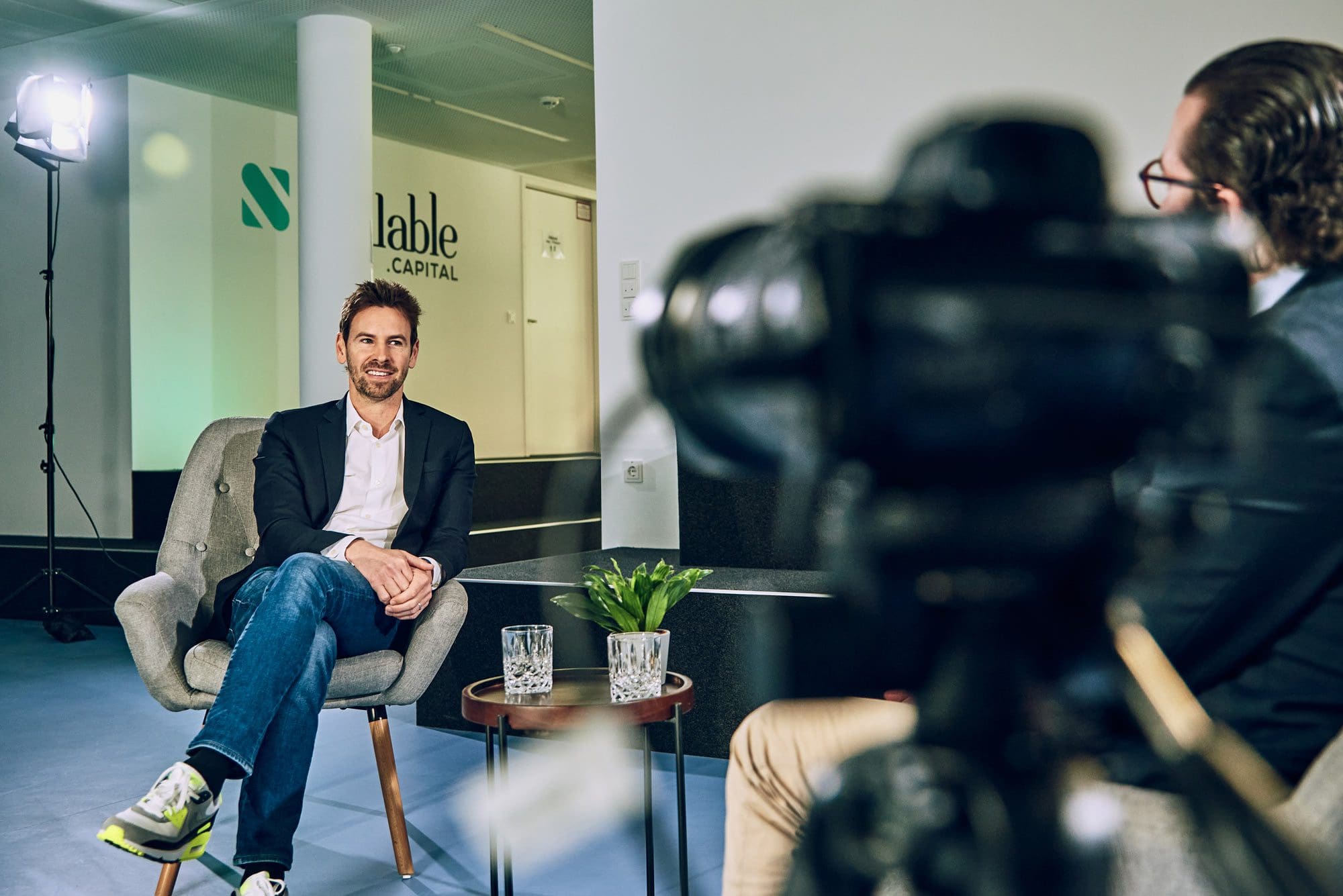
Social media
On LinkedIn & co. we share real glimpses from productions and projects — our own images instead of templates.
Downloads
Everything partners, print shops and press need — no form, no asking.
Color values: Navy #111827 · Coral #FC5130 — all others copyable above.
Need something like this?
We build brands that work in everyday use — from logo to living application. Let’s look at yours together.